1. My expectations for the course were to be able to look at art a different way, not just for its beauty but for its time to make, effort, and meaning. Aesthetics are a great plus believe me, but to see the detail an artist put into a piece really gave me a new appreciation for art.
2. Art is human expression of feelings in a physical yet not always tangible entity. Art can be a scrapbook, a painting, a performance, a sculpture etc. my initial posting was similar however lacked understanding of what art means. I've learned you can't always look too deep into art, but its also fun to look deep into art.
3. I started by saying I didn't have a favorite artist, maybe mentioning a few famous artists however I have now confirmed that my favorite 3 artists are Michelangelo, Raphael, and Leonardo Di Vinci. There is a difference in my confidence as to who my favorite artists are, now I can say it with honesty that I enjoy the work of the three I mentioned.
4. Now that I have completed this course, I feel good about taking online classes. My answer is basically the same as my previous answer only this time, I feel like I have a good well rounded grasp on using online sources, and I learned a few new things about blogging, and embedding links to turn in assignments.
Tuesday, May 10, 2016
Saturday, May 7, 2016
Art Gallery visit # 3


(Left to Right)
The first inspiration image is a self portrait by Frieda Kahlo (Oil on Masonite) 1938 and is called Self Portrait with Monkey.
Note* The Albright Knox museum only had one work that was technically a self portrait, and that was the work by Frida Kahlo. The rest of the pictures I took at the museum, were portraits of other people done by various artists. I know it strays from the guidelines, but I was inspired by the portraits and the idea of how we view ourselves as opposed to how we view others.
The second inspiration image is a piece called Tam Gan by Robert Henri (Oil on Canvas) 1914
The third inspiration image is a piece called Life's Extraction by Olivia Carney (Charcoal and Watercolor) 2016
The fourth inspiration image is a piece called Mysterious Faces by Eli Dreyfuss (Photograph) 2016


1. I selected the inspiration pieces because they each piece was a different take on representing a face.
2. I chose pencil to do my self portrait because it was easy and more accurate to work with than charcoal.
3. I didn't face any challenges when creating my self portrait, I actually just looked at my main features, and used the photograph of myself plus my self image of myself to sketch what I think I look like to the world.
4. The picture represents how I look when I go out of the house, or to work.
5. I applied line when sketching out the shape of my features and texture when sketching detail to those features.
6. I did enjoy working on this project, I really like drawing.
7. I think my final artwork is pretty good for an average Joe. I mean I work in a machine shop, you should see the looks I get when I walk into a refined place such as the art museum.
Saturday, April 30, 2016
Week 13-14 video review
All three videos made taught me that there are many versions or curating works of art. I always thought that curating had to do specifically with exhibits being uniquely tied together. However the videos showed me that entire museums can be curated to examine a specific them. The Tate video showed me that interactive art is a theme that can be used to guide a visitor through a museum, while the metropolitan video showed me that curation technique and innovation in doing so can hold a visitors attention to each piece as they move through a gallery. The lowbrow video showed me that art can be "lower class" but still have important points or deep concepts that aren't necessarily intellectual or formal. These lowbrow works reminded me of Cream's Disraeli gears album cover and somewhat of Jimi Hendrix Axis Bold as Love cover.
The videos did relate to project #4 in that curation itself is an art, in putting it together I realized how much work goes into the arrangement of art so the exhibition flows seamlessly. Curation and the creation of art each make the other one look like easier work, when indeed one is not more work than the other; but an exercise of the creativity of the mind.
The films were great, they expanded my view on the curation process and were fun to watch. They filled in ideas of curation I was confused about before starting the project.
Creating my curating project
My process in creating my project was pretty straight forward. I began by choosing a theme that I would be able to find multiple pieces of art that represented it. I then began selecting works that I found that common theme in. I was then able to interpret each piece of art and find what I thought represented my theme and talk about it a little bit. I thought creating a power point style presentation was perfect for this assignment, it was very easy to work with the images and organize a neat presentation.
Sunday, April 17, 2016
Art Gallery Visit 2
The Exhibition:
1. The Title of the exhibition that was at the Albright Knox Art Museum was Erin Shirreff.
2. The theme of the exhibit seemed to be pieces that represented Form.
The Gallery:
1. The exhibit consisted of five rooms and the lighting in the gallery was well lit in the main room of the exhibition. In the four other rooms that were used, two were dark (One using a television, and one using a projector to display pieces). Out of the other two rooms, one was well lit and the other was dim lit, and very quaint. All rooms seemed to use a spotlight on each piece of art, except for the two dark rooms.
2. The wall color in the main room was (bright white), in the room with the television (black), in the room with the projector (brown), in the room with the photos of clay knives (bright white), and in the room with the photos of people looking at art (forest green).
3. tables were used in the interior architecture to display two steel sculptures, the rest of the artwork was hung on the walls.
4. The movement didn't flow very well for this exhibit, in fact I had to check each info tag to make sure the work in the other four rooms were still part of the exhibit (they were).
The Artwork:
1. The artwork was arranged with all of the sculptures in the main room of the exhibit, two separate rooms had pictures but they were different concepts (hence the different rooms), the other two rooms; one used a projector, the other used a television.
2. The artworks are similar in that either they were scultures, or photos of sculptures that represented a theme of form. The only art that was different that I liked were the photos of people looking at art in the Albright Knox. These themselves put a different perspective on form.
3. The artoworks are different in that they use different media. The sculptures used Scraps from a metal cutting process, the photos of sculptures depicted sculptures made of clay, and the pictures of people looking at art depict humans as a form.
4. The sculptures were not framed, but were either hung on the walls or leaned up against the walls. The pieces that were framed used black frames, and were very clean and modern looking.
5. The artwok was identified and labeled with white paper tags that stuck on the wall near each piece. The info. for the pictures of the people looking at art was actually text painted on the wall of the room that they were in.
6. Aside from being in separate rooms, the actual spacing between pieces in the same room ranged from three feet between pictures to ten feet between sculptures.
Art Criticism:


1. The three pieces have an excellent theme of form, although the second two are sculpted from different materials by Shirreff, and the first a photograph of someone else's sculpture they represent form well.
2. I see a form of a boulder sculpted in the first photo, with detail to texture. The second photo depicts the form of a knife (molded out of clay). The third is an abstract form created out of steel scrap metal.
3. The elements of texture and implied shape are used in photo one. Texture being that of a boulder and implied shape being the shapes formed when light is shined at the boulder which is what Shirreff did to capture the image. The element of form is really evident in photo two because we can see how the blade is arced and golds its form. Implied shape is used in photo three because pieces are cut out of the steel that are circular or semi circular, and when you walk around the sculpture, the shapes change based on the material behind them.
4. I don't see anything in the work as far as metaphor or symbols but the metal piece in picture three reminds me of the water jet class that I took at ECC when I went for machining. The Jetstream of water could cut steel into even more intricate shapes than these, but its the same princeble.
5. I think Sherriff was trying to say that no matter what form we take on, we are all here and can be expressed in any way. Each piece is made out of different material, and its kind of like humans in that we are all created looking different from one another but we can express similar feelings.
Documenting:
These are some pictures of what I experienced during my visit


Saturday, April 16, 2016
Expressionism video and Dada and Surrealism
I selected the two videos because I was familiar with the concepts of surrealism and expressionism. Last semester I took a cinema class and we covered a chapter on German expressionism in theatre and further into film. The general idea of German expressionism was that it was a technique used where backdrops and props were make dramatic using shading, shadows and color to really help a stage set pop and give intense feelings to the audience. Its movement into film generally went into the genre of horror because the look of German expressionism was creepy, and it flowed well into the genre.
The key concept I learned from the Expressionism is that color was primarily used to enhance the effect of emotion. When a viewer looks on a piece of art, its usually the color of the piece that draws the eye into the work. The artist can then use other elements to move the viewer's eye round the piece in general, or along a guided line meaning the artist can guide you to specific things in a specific order. From the Surrealism video, I learned that both shape and color influence surrealism in that you don't just recreate what you see wen creating something new. The artist can create an image that represents something without looking at all like it.
The videos relate to the readings in the text in that they had more examples of what surrealism and expressionism is. The book does an excellent job of explain it, but its nice to see even more examples than just a few pages worth.
I really liked the films, because they add to the book readings and its nice to relax and be guided through a subject rather than reading nonstop about a topic.
Sunday, April 10, 2016
Creating a 3D Mask


The above three masks are where I drew my inspiration from when I created my mask. I selected them because I like the addition of horns to the mask that really give a 3D effect. I also like how mask #2 had a gold paint that gives a delicate feature to the mask. Masks 1 and 3 have a symmetry to them that I used when creating my mask as well. I ultimately chose these masks because I like the way they look as decorative pieces.
The masks above make use of line, color and shape in the way they are decorated. The use of symmetry is used in masks one and three which I previously mentioned. Mask three has implied shape in the ay its horns make a circle. All of the masks have a texture to them as well.

The picture above is a rough sketch of the mask I wanted to create.


This is the mask I created out of clay. I used a plastic mask as a template to get the shape of a face, and then I formed the exaggerated features and used acrylic paint to paint its design. I used symmetry when creating the mask to achieve balance. I also used color when I painted to mask. I used line when I painted it as well so I could define a white area where I would be painting in a gold design. I also used texture in that under the eyes I did some dot inlays with a sculting tool and later filled them with color as well.
My opinion of the mask is that its ok for not doing any clay modeling in about 10 years. I think if I kept doing this, I could create some impressive pieces of art. I thought creating the mask was fun and I found forming the clay to be relaxing and painting it to be stress relieving.
Saturday, April 9, 2016
Module 10 2 videos
I chose the two films Islamic art: India and the Middle East and African Art. I chose them because both cultures are so distant and unexplored to me. Both cultures seem restricted to me because when I got out of high school, anything middle eastern seemed unwanted or shameful to be interested in because of the state of the union at the time. I've gotten over it, in fact I was never really effected by it however, America is still stand offish to anything Middle eastern because of its relationship with those countries. I picked African Art as well because I've never had good exposure to rich black culture, and it has always intrigued me. I feel like there is still a stigma or tension between black people and white people, it's undeniable, it's why we have the black lives matter movement; which I am in full support of. So, I chose these videos so I could get some background, or exposure to these cultures that I feel I have been denied by society.
The key concept I learned from the Islamic Art film based on the work I have seen is that the culture of the middle east, and the religion of Islam is delicate and detailed. I feel like it symbolized a long history that is barely ever talked about. The key concept I learned in the film African Art is that some of the art is functional which was interesting to me. I like how the African religious beliefs are explored through performance art that taps into the spiritual realm.
I really liked both films, they added a lot of insight to both cultured for me and a new value for those types of art. They add depth to the reading in that the videos are always like a live up close demonstration of what the text is trying to say, and that's what I like about watching these videos.
Saturday, April 2, 2016
The Drawings of Michelangelo and Leonardo Da Vinci: The Mind of the Renaissance
I chose to watch these two videos because I was curious to find out more about Leonardo Da Vinci beyond the Mona Lisa. I also chose the drawings of Michelangelo because I wanted to know more about him beyond the statue of David.
For the Leonardo Da Vinci film, the key concept I gathered was that Leonardo was respected by those who knew the quality of his work, and disregarded by many as well because of his lack of formal education. It was inspiring to see that he put together a 10 bullet letter that built up his credentials, and he did it himself it was amazing. It reminded me of Leonardo DiCaprio in catch me if you can creating his credentials to get ahead in his life. Obviously two different scenarios completely, but to have to create yourself because people don't believe in your skill is similar. It also shocked me that all of the work Leonardo Da Vinci was commissioned to do, was never actually turned in to the people that commissioned him to do it and so we re left with this mysterious collection of artwork.
The Michelangelo movie showed me that the drawings he did were readily available for any serious student to handle and look at in the Museum of England. It was shocking to see his growth from what he learned from his master to ultimately surpassing the master, so much so that the master becomes envious of the student's skill. They say that a pupil that does not come close to a masters skill level reflects a poor teacher so that in itself should show the instructor just ho good of a teacher he was. Michelangelo's study and concept of human form was impeccable on paper, and he able to take the drawings to stone sculpture almost, easily.
The videos relate to the text in that drawing and sketching can be a work of art in themselves or a smaller but impressive building block or even a blueprint for a greater piece of artwork or idea.
The films were excellent in adding depth to the concepts of who these men were and what they had to offer as far as their abilities to re create and put thought of visual concept on to paper.
Dominant hand vs. Non Dominant Hand


Using my hand for subject matter was nice because it was very quick reference, and right there when I needed it! Although doing something and coming back to the initial pose based on what I had drawn threw me off a bit, I did the best I could to repose in a close position.
I chose to do the drawings in charcoal, because that was the media I had initially bought for my value scale project.
Creating the subject with my non dominant hand felt strange in that I had control of the charcoal pencil, but I felt like I was really letting the pencil do the work, it was somewhat difficult to get as good of a drawing as my dominant hand as you can see by the wonky looking thumb drawn with my left hand.
I feel it was a successful study in that I found I can still somewhat sketch something with my non dominant hand. I mean, it's not the best, but it's still a recognizable hand.
I would consider doing artwork in the future with my non dominant hand for fun on a piece of work that would be more of a test but also serious if it came out decent. But if I was commissioned to do a piece for someone, I would certainly use my dominant hand.
Saturday, March 12, 2016
assignment M7 video review
I chose to watch the two videos Architecture: The Science of Design and Last Call for Planet Earth: Sustainable Development and Architecture. In the movie Architecture: The Science of Design some key concepts I learned were how structural integrity is important to how architecture stands up to our ever changing climate. I also learned that miniature models of cities are used in wind tunnels with vapor to study how wind flows and how it effects certain areas. The actual model of the building can then be changed or modified to achieve desired effects when it comes to wind. Different changes can take place like adjusting the base of the building, or adding trees to absorb the elements.
In the movie Last Call for Planet Earth: Sustainable Development and Architecture, some key concepts I learned were how architecture can coexist and must exists hand in hand with nature. They talked about how different elements can be used to insulate homes and buildings, and how natural light can be used based on how a structure is positioned to get the most use out of the light. I key concept here was to reduce the use of energy because we are basically in a terminal relationship with the earth because we don't care how many resources we are blowing through daily.
The videos relate to the reading in the book because in the text we learned how different styles of architecture developed in the last 2,000 years or so, much of which has stood up to the elements, The videos talked more about the way architecture is moving to be the same way in our future.
I liked the films, they added depth to my understanding of architecture in that there is more scientific study involved in how new buildings are erected. The goal being environmentally friendly, and energy efficient.
I chose the two films I did because the titles caught my attention. I wanted to see what goes into the process of building a structure, and how our future could be effected by how we build a building.
Saturday, March 5, 2016
Peer Reviews
Peer review #1:
http://abstractmuse.blogspot.com/
Project #1
Project #1 looked pretty good to me, aside from it not being in the blog and just linked on the blog as a photobucket page. I have a feeling when I was looking for people that actually completed these projects that those that did couldn't get it directly on their blog page. The pictures represented each element and principle just fine.
Project #2
http://abstractmuse.blogspot.com/2016/02/project-2-art-gallery-visit-1_28.html
Project #2 had the answers to the questions and descriptions of each painting but was poorly done in that she never uploaded the actual images to the blog. It was really hard to connect anything she was saying about the pieces because i couldn't see them.
Peer review #2
Project #1
http://sidorwi01.blogspot.com/2016/02/project-1-14-elements.html?showComment=1457237955395#c6470475957051762129
Project #1 looked really good to me, I thought all elements and principles were captured even though He felt limited in what he had available for subject matter.
Project # 2
http://sidorwi01.blogspot.com/2016/02/project-2.html?showComment=1457238290784#c4467387599816203659
This project #2 was incredible. He did what I did and posted the images directly to the blog which was easy to find, and clearly labeled. He chose one picture to learn more about which I used in my project # 2, so I provided my insight. He did and excellent job on this project.
The process of going through these blogs was frustrating in that so many people either chose not to do the assignments or they were done poorly with no pictures embedded directly to the blog. I went through about 10 people before i found one blog that kind of worked and another blog that was done amazing. I think that getting a peer review is really nice, I was surprised when I read mine, before I knew it was an assignment to do so. I thought someone actually took time to look at my blog on their own, haha! But like I said it's not to get critique.
Video Review
Through the eyes of the sculptor was a really engaging video in how it presented sculpting. It was really cool to see because I've always wondered how sculpting say a statue for a building or a bridge was actually done. I really liked that they visited a sculptor that was working on a 17th century restoration project where he was copying original heads that were sculpted under King Henry. I like how they said that when you recreate or restore a sculpture, the sculptor's feelings have to go into every strike on the stone. In the text they talk about different types of sculpting such as casting and assembling and mention that each is an indirect method of sculpting. The way they were helping restore the bridge was a hands on direct method that I really enjoyed watching.
The glass and ceramics video was interesting to me as I have created ceramic pieces before. However I didn't know that quality of clay used as well as temp. and time the pieces are fired result in different outcomes such as fine china as opposed to floor tiles. The film related to the text in that it discussed different forms or use of glass and ceramics such as pottery and tiles where the text shows us more aesthetic uses for ceramic such as installation pieces where people can be immersed in the beauty of ceramic and glass work.
I thought the videos were really cool. I always wondered how a sculptor approached a stone and just went to work to create such a beautiful end piece of art. Its still amazing to me, and somewhat mysterious even having learned about it, which is what I enjoy the most about appreciating stone work whether it's architectural or simply for visual art.
Sunday, February 28, 2016
Creating a Logo


I thought creating a logo was cool. I don't think I would enjoy creating logos as a job or anything like that, but getting creative and coming up with a logo that is pure me was interesting and fun.
My process was simple in creating a logo. I thought about what I am at the center of my being and that is a free thinker. I believe that ideas should be shared between anyone and everyone, whether they are good or bad, the process of free thinking generates new ideas, and edited or revised ideas. I used the elements of Line, color, value, and implied shape to create what I thought a good logo for free thinkers would look like.
The most important thing I discovered while making my logo was the fact that when I was began to overlap the question marks coming out of the free thought box, I realized that it was good to keep going and even overlap more because in life, ideas overlap and blend together to make bigger and better ideas; so that's why they are touching.
The videos were very helpful in deciding what could be used as a legitimate logo and what the process of creation is like. I thought the most important thing they mentioned was the fact that logo ideas can come from many places like a picture you've come across at an earlier time or something you've seen before and got influenced by.


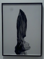
The painting on the left is titled Theater Box by Everett Shinn and was painted in 1906 using oil on canvas. The painting on the right is titled La vie paysanne (Peasant Life) by Marc Chagall and was painted in 1925 also using oil on canvas. These two paintings had an impact on me because they represent two completely different lifestyles, The first painting is painted in a first person perspective and depicts the viewer sitting in a theater box (which is one of the best seats in the house), watching a play; the feeling is that of a privileged person. The second painting depicts a peasant in a field with a horse observing people dancing in the background as well as children in a school, and passers by in a horse and buggy. The feeling this painting gives is that of a not so privileged person.


The painting on the left is titled La Voix des airs (The Voice of Space) by Rene Magritte and was painted in 1928 using oil on canvas. The painting on the right is titled Page Boy at Maxim's by Chaim Soutine and was painted in 1927 also using oil on canvas. I felt a connection with The Voice of Space because for a painting done in 1928, it has a futuristic Sci-fi feeling. I am interested in both space and sci-fi, so I thought this piece was really nice. I feel a connection to the Page Boy at Maxim's simply because I hate the piece, I actually look at it and I just hate it, its ugly. The last time I was at the Albright Knox museum was over 10 years ago and I saw and hated this painting then; sure enough its still there and when I turned the corner and saw this ugly bell boy staring at me I had to get a picture of the one piece of art in the museum that bothers me the most.


The painting on the top is titled Manao tupapau (Spirit of the Dead Watching) by Paul Gauguin painted in 1892 in oil on burlap mounted on canvas. The piece on the bottom is titled White Flag and was painted by Paul Fagerskiold in 2013 using oil paint, sand, and gravel on canvas, I would like to know more about the Spirit of the Dead Watching becausew the background information stated that the artist went to Tahiti to paint exotic things to fetch a higher price in paris. It got me wondering whether or not it worked because the info then side tracked into how this was a portrait of his 13 year old wife he met when he got to Tahiti (pretty controversial in present time). So, did he get the money? I would like to know more about the painting on the right and where the artist was coming from and what his message was. The painting depicts a style of flag the resembled the United States flag only its completely white which traditionally represents surrender. I was wondering, what should the United States surrender to? We are traditionally taught to never give up, its interesting to me.
Sunday, February 21, 2016
Color and Value


I thought that creating a color wheel and value scale was fun. Working with paint and buying materials made me want to get more brushes, start mixing colors and see what I can do on a canvas. I liked working with the paint better than the charcoal. I thought the paint was fun to move around mix and manipulate while the charcoal seemed like it took an extra light touch to achieve a desirable effect, which can be frustrating. The most important discovery I made while creating these was the fact that I could achieve different tones of secondary colors with how I mixed the primary colors, it was fun and it made me want to create. The most important thing I learned from the video was to use a circular pattern when creating value; I had used a more linear pattern which worked for charcoal especially when keeping the white end of the scale light.
Sunday, February 14, 2016
Elements and Principles of Art
During the winter break after last semester I was lucky enough to take a trip to Walt Disney World in Orlando Florida. During said trip, I had taken over a thousand pictures and thought this project would be a perfect opportunity to go through what I had on my SD card in search of the different Elements and Principles of Art. I found what I think are great examples of each principle and element. My process was basically reviewing what each element and principle was in the book, as far as what each should look like compared to how it was explained in words on the sheets provided for us on blackboard.


Subscribe to:
Posts (Atom)