All three videos made taught me that there are many versions or curating works of art. I always thought that curating had to do specifically with exhibits being uniquely tied together. However the videos showed me that entire museums can be curated to examine a specific them. The Tate video showed me that interactive art is a theme that can be used to guide a visitor through a museum, while the metropolitan video showed me that curation technique and innovation in doing so can hold a visitors attention to each piece as they move through a gallery. The lowbrow video showed me that art can be "lower class" but still have important points or deep concepts that aren't necessarily intellectual or formal. These lowbrow works reminded me of Cream's Disraeli gears album cover and somewhat of Jimi Hendrix Axis Bold as Love cover.
The videos did relate to project #4 in that curation itself is an art, in putting it together I realized how much work goes into the arrangement of art so the exhibition flows seamlessly. Curation and the creation of art each make the other one look like easier work, when indeed one is not more work than the other; but an exercise of the creativity of the mind.
The films were great, they expanded my view on the curation process and were fun to watch. They filled in ideas of curation I was confused about before starting the project.
Saturday, April 30, 2016
Creating my curating project
My process in creating my project was pretty straight forward. I began by choosing a theme that I would be able to find multiple pieces of art that represented it. I then began selecting works that I found that common theme in. I was then able to interpret each piece of art and find what I thought represented my theme and talk about it a little bit. I thought creating a power point style presentation was perfect for this assignment, it was very easy to work with the images and organize a neat presentation.
Sunday, April 17, 2016
Art Gallery Visit 2
The Exhibition:
1. The Title of the exhibition that was at the Albright Knox Art Museum was Erin Shirreff.
2. The theme of the exhibit seemed to be pieces that represented Form.
The Gallery:
1. The exhibit consisted of five rooms and the lighting in the gallery was well lit in the main room of the exhibition. In the four other rooms that were used, two were dark (One using a television, and one using a projector to display pieces). Out of the other two rooms, one was well lit and the other was dim lit, and very quaint. All rooms seemed to use a spotlight on each piece of art, except for the two dark rooms.
2. The wall color in the main room was (bright white), in the room with the television (black), in the room with the projector (brown), in the room with the photos of clay knives (bright white), and in the room with the photos of people looking at art (forest green).
3. tables were used in the interior architecture to display two steel sculptures, the rest of the artwork was hung on the walls.
4. The movement didn't flow very well for this exhibit, in fact I had to check each info tag to make sure the work in the other four rooms were still part of the exhibit (they were).
The Artwork:
1. The artwork was arranged with all of the sculptures in the main room of the exhibit, two separate rooms had pictures but they were different concepts (hence the different rooms), the other two rooms; one used a projector, the other used a television.
2. The artworks are similar in that either they were scultures, or photos of sculptures that represented a theme of form. The only art that was different that I liked were the photos of people looking at art in the Albright Knox. These themselves put a different perspective on form.
3. The artoworks are different in that they use different media. The sculptures used Scraps from a metal cutting process, the photos of sculptures depicted sculptures made of clay, and the pictures of people looking at art depict humans as a form.
4. The sculptures were not framed, but were either hung on the walls or leaned up against the walls. The pieces that were framed used black frames, and were very clean and modern looking.
5. The artwok was identified and labeled with white paper tags that stuck on the wall near each piece. The info. for the pictures of the people looking at art was actually text painted on the wall of the room that they were in.
6. Aside from being in separate rooms, the actual spacing between pieces in the same room ranged from three feet between pictures to ten feet between sculptures.
Art Criticism:


1. The three pieces have an excellent theme of form, although the second two are sculpted from different materials by Shirreff, and the first a photograph of someone else's sculpture they represent form well.
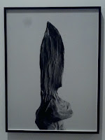
2. I see a form of a boulder sculpted in the first photo, with detail to texture. The second photo depicts the form of a knife (molded out of clay). The third is an abstract form created out of steel scrap metal.
3. The elements of texture and implied shape are used in photo one. Texture being that of a boulder and implied shape being the shapes formed when light is shined at the boulder which is what Shirreff did to capture the image. The element of form is really evident in photo two because we can see how the blade is arced and golds its form. Implied shape is used in photo three because pieces are cut out of the steel that are circular or semi circular, and when you walk around the sculpture, the shapes change based on the material behind them.
4. I don't see anything in the work as far as metaphor or symbols but the metal piece in picture three reminds me of the water jet class that I took at ECC when I went for machining. The Jetstream of water could cut steel into even more intricate shapes than these, but its the same princeble.
5. I think Sherriff was trying to say that no matter what form we take on, we are all here and can be expressed in any way. Each piece is made out of different material, and its kind of like humans in that we are all created looking different from one another but we can express similar feelings.
Documenting:
These are some pictures of what I experienced during my visit


1. The Title of the exhibition that was at the Albright Knox Art Museum was Erin Shirreff.
2. The theme of the exhibit seemed to be pieces that represented Form.
The Gallery:
1. The exhibit consisted of five rooms and the lighting in the gallery was well lit in the main room of the exhibition. In the four other rooms that were used, two were dark (One using a television, and one using a projector to display pieces). Out of the other two rooms, one was well lit and the other was dim lit, and very quaint. All rooms seemed to use a spotlight on each piece of art, except for the two dark rooms.
2. The wall color in the main room was (bright white), in the room with the television (black), in the room with the projector (brown), in the room with the photos of clay knives (bright white), and in the room with the photos of people looking at art (forest green).
3. tables were used in the interior architecture to display two steel sculptures, the rest of the artwork was hung on the walls.
4. The movement didn't flow very well for this exhibit, in fact I had to check each info tag to make sure the work in the other four rooms were still part of the exhibit (they were).
The Artwork:
1. The artwork was arranged with all of the sculptures in the main room of the exhibit, two separate rooms had pictures but they were different concepts (hence the different rooms), the other two rooms; one used a projector, the other used a television.
2. The artworks are similar in that either they were scultures, or photos of sculptures that represented a theme of form. The only art that was different that I liked were the photos of people looking at art in the Albright Knox. These themselves put a different perspective on form.
3. The artoworks are different in that they use different media. The sculptures used Scraps from a metal cutting process, the photos of sculptures depicted sculptures made of clay, and the pictures of people looking at art depict humans as a form.
4. The sculptures were not framed, but were either hung on the walls or leaned up against the walls. The pieces that were framed used black frames, and were very clean and modern looking.
5. The artwok was identified and labeled with white paper tags that stuck on the wall near each piece. The info. for the pictures of the people looking at art was actually text painted on the wall of the room that they were in.
6. Aside from being in separate rooms, the actual spacing between pieces in the same room ranged from three feet between pictures to ten feet between sculptures.
Art Criticism:


1. The three pieces have an excellent theme of form, although the second two are sculpted from different materials by Shirreff, and the first a photograph of someone else's sculpture they represent form well.
2. I see a form of a boulder sculpted in the first photo, with detail to texture. The second photo depicts the form of a knife (molded out of clay). The third is an abstract form created out of steel scrap metal.
3. The elements of texture and implied shape are used in photo one. Texture being that of a boulder and implied shape being the shapes formed when light is shined at the boulder which is what Shirreff did to capture the image. The element of form is really evident in photo two because we can see how the blade is arced and golds its form. Implied shape is used in photo three because pieces are cut out of the steel that are circular or semi circular, and when you walk around the sculpture, the shapes change based on the material behind them.
4. I don't see anything in the work as far as metaphor or symbols but the metal piece in picture three reminds me of the water jet class that I took at ECC when I went for machining. The Jetstream of water could cut steel into even more intricate shapes than these, but its the same princeble.
5. I think Sherriff was trying to say that no matter what form we take on, we are all here and can be expressed in any way. Each piece is made out of different material, and its kind of like humans in that we are all created looking different from one another but we can express similar feelings.
Documenting:
These are some pictures of what I experienced during my visit


Saturday, April 16, 2016
Expressionism video and Dada and Surrealism
I selected the two videos because I was familiar with the concepts of surrealism and expressionism. Last semester I took a cinema class and we covered a chapter on German expressionism in theatre and further into film. The general idea of German expressionism was that it was a technique used where backdrops and props were make dramatic using shading, shadows and color to really help a stage set pop and give intense feelings to the audience. Its movement into film generally went into the genre of horror because the look of German expressionism was creepy, and it flowed well into the genre.
The key concept I learned from the Expressionism is that color was primarily used to enhance the effect of emotion. When a viewer looks on a piece of art, its usually the color of the piece that draws the eye into the work. The artist can then use other elements to move the viewer's eye round the piece in general, or along a guided line meaning the artist can guide you to specific things in a specific order. From the Surrealism video, I learned that both shape and color influence surrealism in that you don't just recreate what you see wen creating something new. The artist can create an image that represents something without looking at all like it.
The videos relate to the readings in the text in that they had more examples of what surrealism and expressionism is. The book does an excellent job of explain it, but its nice to see even more examples than just a few pages worth.
I really liked the films, because they add to the book readings and its nice to relax and be guided through a subject rather than reading nonstop about a topic.
Sunday, April 10, 2016
Creating a 3D Mask


The above three masks are where I drew my inspiration from when I created my mask. I selected them because I like the addition of horns to the mask that really give a 3D effect. I also like how mask #2 had a gold paint that gives a delicate feature to the mask. Masks 1 and 3 have a symmetry to them that I used when creating my mask as well. I ultimately chose these masks because I like the way they look as decorative pieces.
The masks above make use of line, color and shape in the way they are decorated. The use of symmetry is used in masks one and three which I previously mentioned. Mask three has implied shape in the ay its horns make a circle. All of the masks have a texture to them as well.

The picture above is a rough sketch of the mask I wanted to create.


This is the mask I created out of clay. I used a plastic mask as a template to get the shape of a face, and then I formed the exaggerated features and used acrylic paint to paint its design. I used symmetry when creating the mask to achieve balance. I also used color when I painted to mask. I used line when I painted it as well so I could define a white area where I would be painting in a gold design. I also used texture in that under the eyes I did some dot inlays with a sculting tool and later filled them with color as well.
My opinion of the mask is that its ok for not doing any clay modeling in about 10 years. I think if I kept doing this, I could create some impressive pieces of art. I thought creating the mask was fun and I found forming the clay to be relaxing and painting it to be stress relieving.
Saturday, April 9, 2016
Module 10 2 videos
I chose the two films Islamic art: India and the Middle East and African Art. I chose them because both cultures are so distant and unexplored to me. Both cultures seem restricted to me because when I got out of high school, anything middle eastern seemed unwanted or shameful to be interested in because of the state of the union at the time. I've gotten over it, in fact I was never really effected by it however, America is still stand offish to anything Middle eastern because of its relationship with those countries. I picked African Art as well because I've never had good exposure to rich black culture, and it has always intrigued me. I feel like there is still a stigma or tension between black people and white people, it's undeniable, it's why we have the black lives matter movement; which I am in full support of. So, I chose these videos so I could get some background, or exposure to these cultures that I feel I have been denied by society.
The key concept I learned from the Islamic Art film based on the work I have seen is that the culture of the middle east, and the religion of Islam is delicate and detailed. I feel like it symbolized a long history that is barely ever talked about. The key concept I learned in the film African Art is that some of the art is functional which was interesting to me. I like how the African religious beliefs are explored through performance art that taps into the spiritual realm.
I really liked both films, they added a lot of insight to both cultured for me and a new value for those types of art. They add depth to the reading in that the videos are always like a live up close demonstration of what the text is trying to say, and that's what I like about watching these videos.
Saturday, April 2, 2016
The Drawings of Michelangelo and Leonardo Da Vinci: The Mind of the Renaissance
I chose to watch these two videos because I was curious to find out more about Leonardo Da Vinci beyond the Mona Lisa. I also chose the drawings of Michelangelo because I wanted to know more about him beyond the statue of David.
For the Leonardo Da Vinci film, the key concept I gathered was that Leonardo was respected by those who knew the quality of his work, and disregarded by many as well because of his lack of formal education. It was inspiring to see that he put together a 10 bullet letter that built up his credentials, and he did it himself it was amazing. It reminded me of Leonardo DiCaprio in catch me if you can creating his credentials to get ahead in his life. Obviously two different scenarios completely, but to have to create yourself because people don't believe in your skill is similar. It also shocked me that all of the work Leonardo Da Vinci was commissioned to do, was never actually turned in to the people that commissioned him to do it and so we re left with this mysterious collection of artwork.
The Michelangelo movie showed me that the drawings he did were readily available for any serious student to handle and look at in the Museum of England. It was shocking to see his growth from what he learned from his master to ultimately surpassing the master, so much so that the master becomes envious of the student's skill. They say that a pupil that does not come close to a masters skill level reflects a poor teacher so that in itself should show the instructor just ho good of a teacher he was. Michelangelo's study and concept of human form was impeccable on paper, and he able to take the drawings to stone sculpture almost, easily.
The videos relate to the text in that drawing and sketching can be a work of art in themselves or a smaller but impressive building block or even a blueprint for a greater piece of artwork or idea.
The films were excellent in adding depth to the concepts of who these men were and what they had to offer as far as their abilities to re create and put thought of visual concept on to paper.
Dominant hand vs. Non Dominant Hand


Using my hand for subject matter was nice because it was very quick reference, and right there when I needed it! Although doing something and coming back to the initial pose based on what I had drawn threw me off a bit, I did the best I could to repose in a close position.
I chose to do the drawings in charcoal, because that was the media I had initially bought for my value scale project.
Creating the subject with my non dominant hand felt strange in that I had control of the charcoal pencil, but I felt like I was really letting the pencil do the work, it was somewhat difficult to get as good of a drawing as my dominant hand as you can see by the wonky looking thumb drawn with my left hand.
I feel it was a successful study in that I found I can still somewhat sketch something with my non dominant hand. I mean, it's not the best, but it's still a recognizable hand.
I would consider doing artwork in the future with my non dominant hand for fun on a piece of work that would be more of a test but also serious if it came out decent. But if I was commissioned to do a piece for someone, I would certainly use my dominant hand.
Subscribe to:
Posts (Atom)