Sunday, February 28, 2016
Creating a Logo
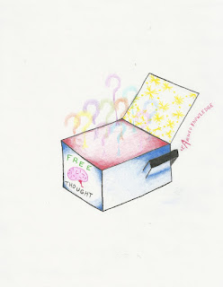
I thought creating a logo was cool. I don't think I would enjoy creating logos as a job or anything like that, but getting creative and coming up with a logo that is pure me was interesting and fun.
My process was simple in creating a logo. I thought about what I am at the center of my being and that is a free thinker. I believe that ideas should be shared between anyone and everyone, whether they are good or bad, the process of free thinking generates new ideas, and edited or revised ideas. I used the elements of Line, color, value, and implied shape to create what I thought a good logo for free thinkers would look like.
The most important thing I discovered while making my logo was the fact that when I was began to overlap the question marks coming out of the free thought box, I realized that it was good to keep going and even overlap more because in life, ideas overlap and blend together to make bigger and better ideas; so that's why they are touching.
The videos were very helpful in deciding what could be used as a legitimate logo and what the process of creation is like. I thought the most important thing they mentioned was the fact that logo ideas can come from many places like a picture you've come across at an earlier time or something you've seen before and got influenced by.
The painting on the left is titled Theater Box by Everett Shinn and was painted in 1906 using oil on canvas. The painting on the right is titled La vie paysanne (Peasant Life) by Marc Chagall and was painted in 1925 also using oil on canvas. These two paintings had an impact on me because they represent two completely different lifestyles, The first painting is painted in a first person perspective and depicts the viewer sitting in a theater box (which is one of the best seats in the house), watching a play; the feeling is that of a privileged person. The second painting depicts a peasant in a field with a horse observing people dancing in the background as well as children in a school, and passers by in a horse and buggy. The feeling this painting gives is that of a not so privileged person.
The painting on the left is titled La Voix des airs (The Voice of Space) by Rene Magritte and was painted in 1928 using oil on canvas. The painting on the right is titled Page Boy at Maxim's by Chaim Soutine and was painted in 1927 also using oil on canvas. I felt a connection with The Voice of Space because for a painting done in 1928, it has a futuristic Sci-fi feeling. I am interested in both space and sci-fi, so I thought this piece was really nice. I feel a connection to the Page Boy at Maxim's simply because I hate the piece, I actually look at it and I just hate it, its ugly. The last time I was at the Albright Knox museum was over 10 years ago and I saw and hated this painting then; sure enough its still there and when I turned the corner and saw this ugly bell boy staring at me I had to get a picture of the one piece of art in the museum that bothers me the most.
The painting on the top is titled Manao tupapau (Spirit of the Dead Watching) by Paul Gauguin painted in 1892 in oil on burlap mounted on canvas. The piece on the bottom is titled White Flag and was painted by Paul Fagerskiold in 2013 using oil paint, sand, and gravel on canvas, I would like to know more about the Spirit of the Dead Watching becausew the background information stated that the artist went to Tahiti to paint exotic things to fetch a higher price in paris. It got me wondering whether or not it worked because the info then side tracked into how this was a portrait of his 13 year old wife he met when he got to Tahiti (pretty controversial in present time). So, did he get the money? I would like to know more about the painting on the right and where the artist was coming from and what his message was. The painting depicts a style of flag the resembled the United States flag only its completely white which traditionally represents surrender. I was wondering, what should the United States surrender to? We are traditionally taught to never give up, its interesting to me.
Sunday, February 21, 2016
Color and Value
I thought that creating a color wheel and value scale was fun. Working with paint and buying materials made me want to get more brushes, start mixing colors and see what I can do on a canvas. I liked working with the paint better than the charcoal. I thought the paint was fun to move around mix and manipulate while the charcoal seemed like it took an extra light touch to achieve a desirable effect, which can be frustrating. The most important discovery I made while creating these was the fact that I could achieve different tones of secondary colors with how I mixed the primary colors, it was fun and it made me want to create. The most important thing I learned from the video was to use a circular pattern when creating value; I had used a more linear pattern which worked for charcoal especially when keeping the white end of the scale light.
Sunday, February 14, 2016
Elements and Principles of Art
During the winter break after last semester I was lucky enough to take a trip to Walt Disney World in Orlando Florida. During said trip, I had taken over a thousand pictures and thought this project would be a perfect opportunity to go through what I had on my SD card in search of the different Elements and Principles of Art. I found what I think are great examples of each principle and element. My process was basically reviewing what each element and principle was in the book, as far as what each should look like compared to how it was explained in words on the sheets provided for us on blackboard.
Saturday, February 13, 2016
Color and Feelings
1. Color has so many effects on emotions. In the assigned video about the use of color, I learned that the use of the color red could have an effect on your appetite. I also learned that the use of color can lay a desired effect on a person with the artists intent. Vincent Van Gogh had used clashing reds and greens to relate his utter distaste and disgust for a diner in what he called his worst painting ever. Color has the effect an artist intends it to have in how the artist applies it, taking into account that certain colors have a psychological effect on emotions, an artist can manage this easily.
2. It is fascinating tome to learn that use of color can make people feel certain feelings. For instance in our text I read that the use of blue is used in Japanese train stations to calm people down that are thinking of committing suicide by jumping in front of trains. I think that the psychological effect that something as simple as color has on our emotions in just tremendous, and yet I had no idea about the theory behind this.
3. The fact that when these artists were painting on walls by applying plaster first, and somewhat sketching their painting on the wet plaster as preparation was astounding to me. They only had one chance to paint the color and deliver the emotion they were feeling in one shot, accompanied by a contract dictating how much of each color they were allowed to use. This must have been a lot of pressure for an artist. So the history of these paintings had the biggest impact on me.
4. The biggest impact was seeing how using dark colors to create a large space that can house so much action is important to the feeling of a painting. It seems that by offering space in it itself give virtual room for many emotions and events to take place in a painting and can in turn make a viewer feel multiple things.
Saturday, February 6, 2016
Aesthetics and neurology
In the movie Aesthetics: Philosophy of the arts I learned that many philosophers had different opinions of what art is, and what is and is not acceptable art. For instance Plato had argued that the manifestation of something beautiful attracts the person who sees it, and that the philosopher leaves behind the apprehension of what is beautiful, transcending the sensible world to achieve contemplation of the idea of pure beauty. This is to say that Plato believed that only a philosopher can know for sure what is and is not beautiful. Plato did not take into account art and aesthetics and held a low opinion of artists and poets because of this flaw. Plato had 3 criteria of why art was a bad thing which include the facts that art confuses authentic with fake, art is suited only for portraying violence, and art is capable of influencing even the best of normal people to act in shameful ways.
Carta: neurobiology neurology and art and aesthetics taught me that people see things such as art and nature in certain ways because of the way the human brain is wired. Things like symmetry and pattern are what most people call essential for art however its deeper rooted than that, they are things that are aesthetically pleasing to the brain. The fact that taking a woman's shape or figure and distorting it so that her breasts are bigger, her hips are curvier, and her waist is thinner are all examples of how art is aesthetically pleasing to how the human brain perceives it. The fact that a rat can be familiar with the bad meaning of a square versus the good meaning of a rectangle and be drawn to a rectangle that is more extreme than another rectangle is also a fascinating example of how something that is aesthetically pleasing can be so influential on a brain.
In the article What the brain draws from art and neuroscience I learned the concept of color versus luminance. The fact that most people have three cones in their retina red, blue, and green to recognize what color they are looking at was something that never occurred to me. Another phenomenon that happens is that the cones activities are compared by the brain to determine the presence of luminosity, or how much light is passing through a specific area of what a person is looking at.
I really thought Friedrick Von Schiller's theory was most important, which basically said that when we develop and hone our aesthetics, that we also develop and hone our moral capacity so much that we can come to the conclusion that aesthetic education renders moral education unnecessary.
In the movie Aesthetics: Philosophy of the arts I thought that Changeux was difficult to understand, and therefore didn't gather any information out of his entire presentation. I thought that Ramachandran was interesting, funny and above all informative with his part of the presentation. I thought the most interesting part of his lecture was that he compared people from different countries views on how they interpreted art and aesthetic, but also showed slides with proof of what he saw when he looked at certain examples.
The videos and articles relate to the text in that they elaborate more on the ideas of the text. Although I thought that the textbook was a bit more informative with the photos and examples, it was nice to see something interactive that covered similar material.
I thought the first video overall was very monotone and hard to keep my attention, and the same feeling was apparent for the first lecture of the second video, I guess you could say they weren't aesthetically pleasing! The second lecture in the second video was excellent, as well as the article. They had interesting information that pulled me right in and kept me engaged.
Subscribe to:
Posts (Atom)